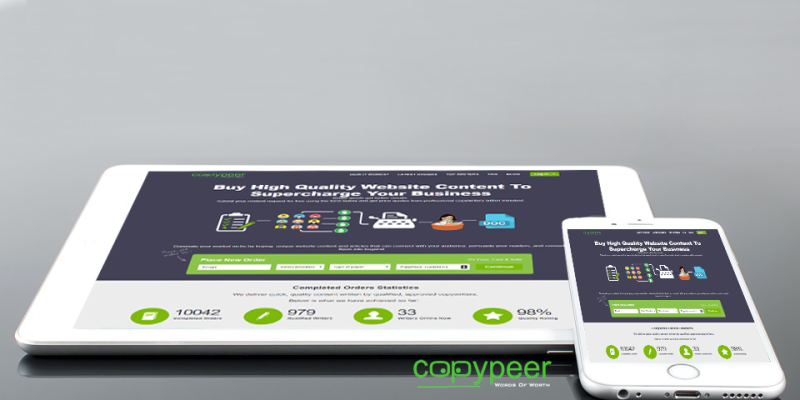
Every time a new person lands on your page, your site goes through a ‘job interview’. Therefore, it is important to make sure that your page has the right elements that will grab the reader’s attention.
A well-designed homepage will get you more sign-ups for your newsletter, more sales, and more conversions.
Below are a few elements that you should put on your website’s homepage:
1. An Attractive Header Image
Your header image is the most important element of your site’s homepage. Your header image is probably the first thing people see when the get to your website. Therefore, it is important to have an image that represents you and the work you do. In addition, your image can be an artwork rather than a photo but should represent your work.
2. A Short Bio
Do not assume that everyone who visits your site already knows who you are and what you do. Having a bio or an elevator pitch on your homepage will let a potential client know who you are and what your website is all about. Keep this bio short and save a longer version for your ‘About Us’ or ‘Bio’ page.
3. A Clear Value Proposition
Tell your visitors exactly what you do with a clear, easy-to-find value proposition. This may seem like a no-brainer, but you would be shocked at how many websites out there do not have one. If people do not understand what your company does, whom it does it for, and how it does it differently, they are not likely to stick around to find out.
4. Links To Social Media
You need people to follow and engage with your company on your social media. So, on your homepage place social media buttons in a consistent, conventional place, where people can easily find them when needed.
5. Intuitive Navigation
Your navigation should be easy to understand and use for a first-time visitor. You want someone to arrive on your website and know exactly where they can find the information they want and need without being confused. Your site should also reflect your buyer’s typical behavior on your site by bringing the pages they visit most often to the forefront.
6. Contact Info
How many times have you been in need of tech support or customer service, but could not get someone on the phone to save your life? It is frustrating, right? Do not do this to your prospects in the same position. Visitors should be able to find your contact information easily on your homepage. Most commonly found in the footer, your homepage should include a mailing address, email address, and phone number in case someone is interested in reaching you.
7. Blog Highlights
Highlight your blog on the homepage to encourage people to view and subscribe to it. Your blog content shows your expertise, helpfulness, and offers people a low-risk option to converting and starting a relationship with your brand. Consider adding a subscription box with a lead magnet or simply including a live feed of your most recent publications.
8. Client Testimonials
If your company has positive reviews from your previous or current customers, capitalize on them. Let your potential customers know that you are not just boasting about accomplishments. A testimonial builds trust and lets people know they can feel confident in choosing you.
9. Video
Create a quick introductory video on your homepage that explains what your business does, shows your office, and/or introduces your team is one of the easiest and most effective ways of engaging a user. In addition, create short videos so that you do not lose your visitor’s interest.
10. A Clear Call-To-Action
Your homepage should state clearly what action you want your clients to take. On your homepage, this is usually a "top-of-the-funnel" action such as subscribing to your blog and/or a "bottom-of-the-funnel" like requesting a consultation. Sit down with your team and decide on what one or two actions you really want people to take when land on your site. Having more than this will only confuse your visitor and clutter your buyer's journey.
Conclusion
Avoid over-cluttering your homepage. Stick to the above elements and use them to direct your users to other sections of your site effectively. Otherwise, if people have too many options/links/images to look at, they might simply ignore it all and leave your site.
